HEY THERE!
I'm Rish.
A UI/UX & Graphic Designer driven by the pursuit of creating impactful experiences through diverse mediums.
Beyond design, you'll find me on the tennis court, drumming to unwind, and recently venturing into 3D printing.
I graduated from the The University of Melbourne, with a degree in User Experience and Graphic Design.
I'm always keen for exciting projects. Feel free to connect with me on any of my socials below.
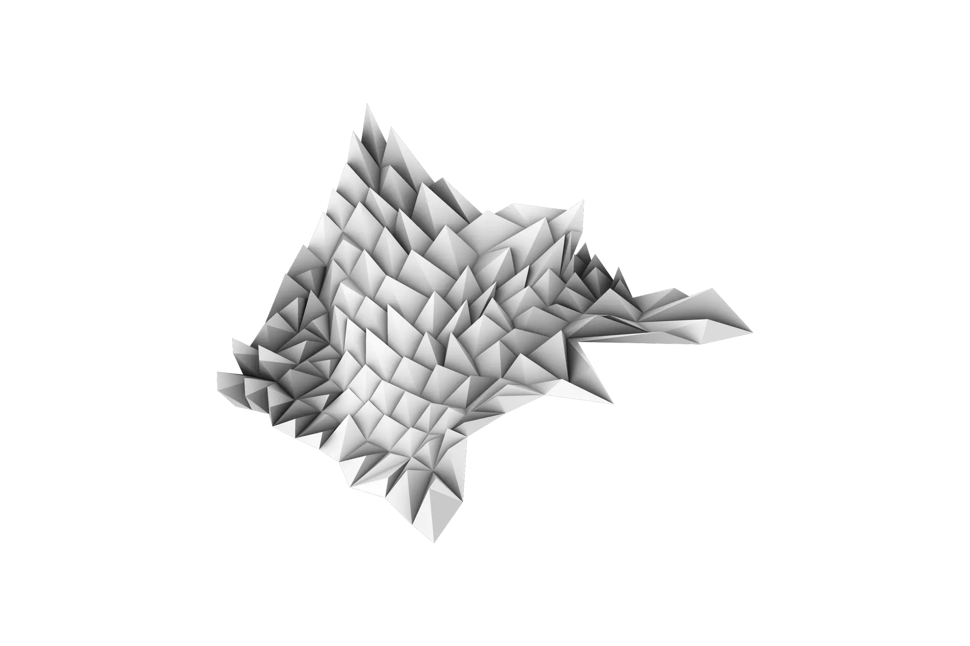
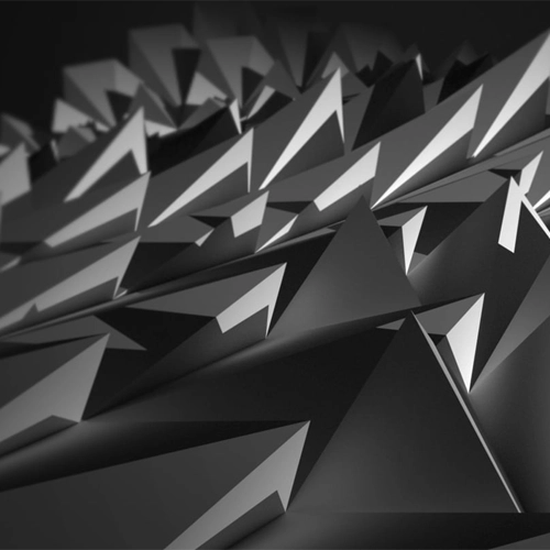
This project aimed to study a sample 2-dimensional pattern and extend it into a representational 3-dimensional surface. The resulting surface aimed to unbind the boundaries of the pattern in order interpret a natural extension of the material. A painting sample and a piece of Tasmanian terrain were provided with the goal of representing the directionality and depth from both materials. This module exposed me to the potentials of 3D modelling with Rhino, and demonstrated the importance of iteration and refinement. Additionally, digital fabrication process was explored heavily by the construction of developable surfaces and consideration of the practicality and feasibility of material usage.
Adobe Illustrator
Adobe Photoshop
Rhino 3D
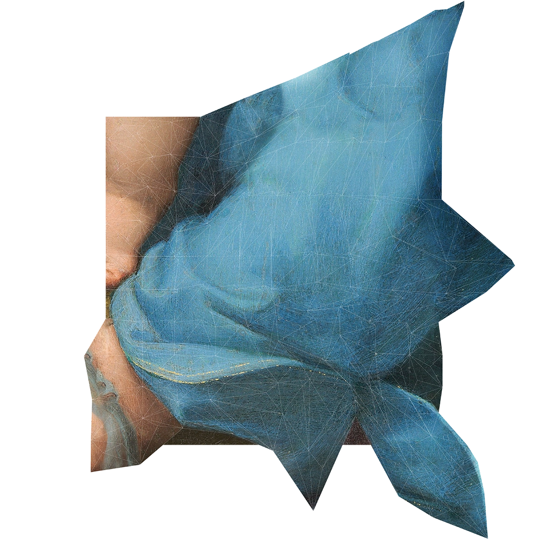
The provided painting sample from Raphael’s, The Alba Madonna (1510), was quite cluttered in terms of the folds and had contrasting regions of highlights and texture. The samples hierarchy was dominated by the blue drapery but it had juxtaposing elements of the subject’s skin towards the outer edges.
The Tasmanian terrain was mostly flat with minor dips at the edges and a slight rise in the centre. It lacked significant elements and was largely planar. Hence more focus was given to panel distribution and grid alteration. This lead to the exploration of using depth to convey texture.
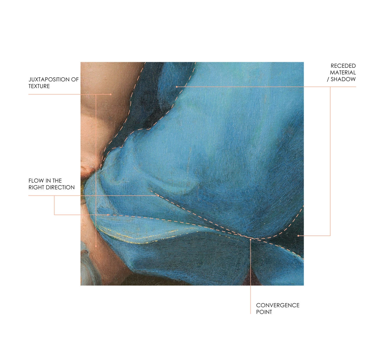
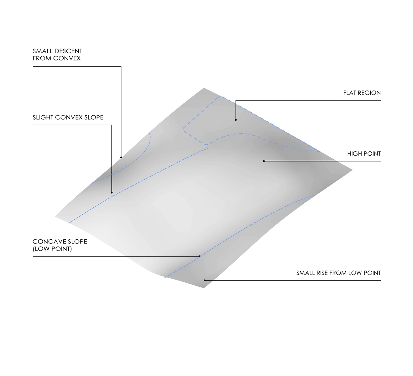
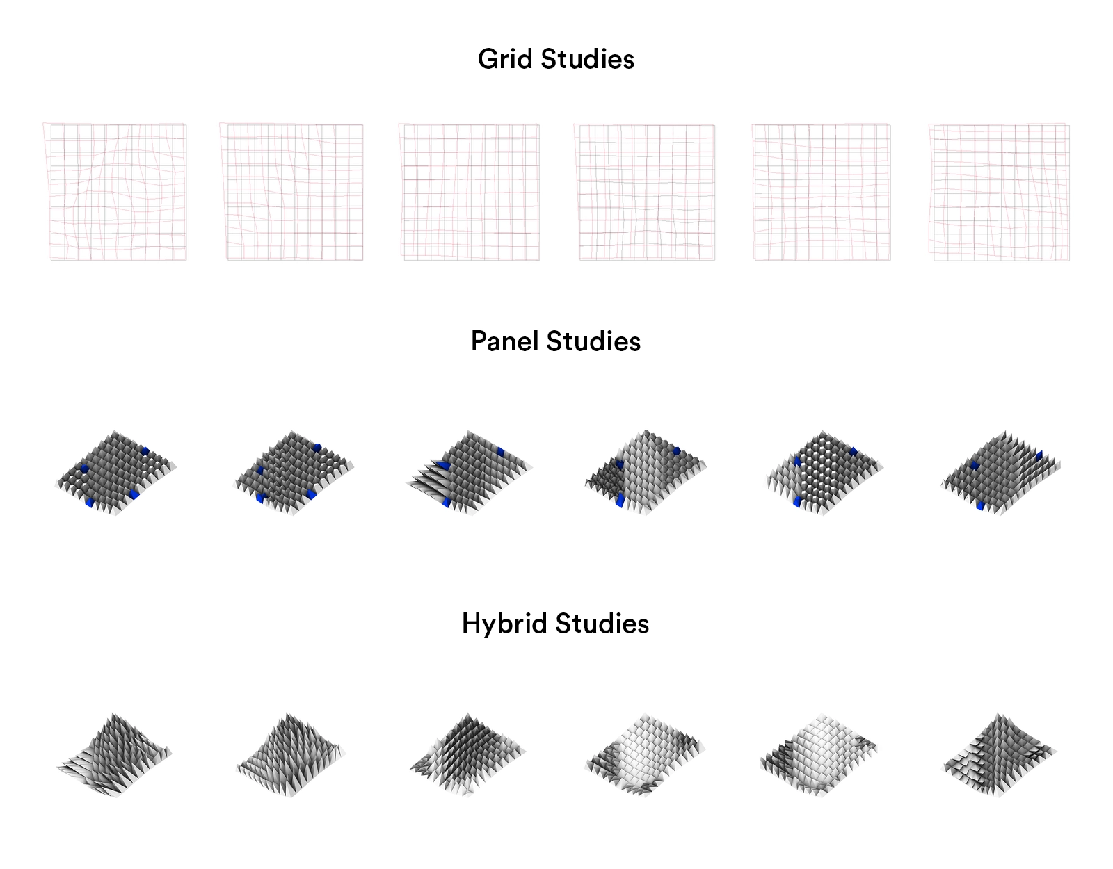
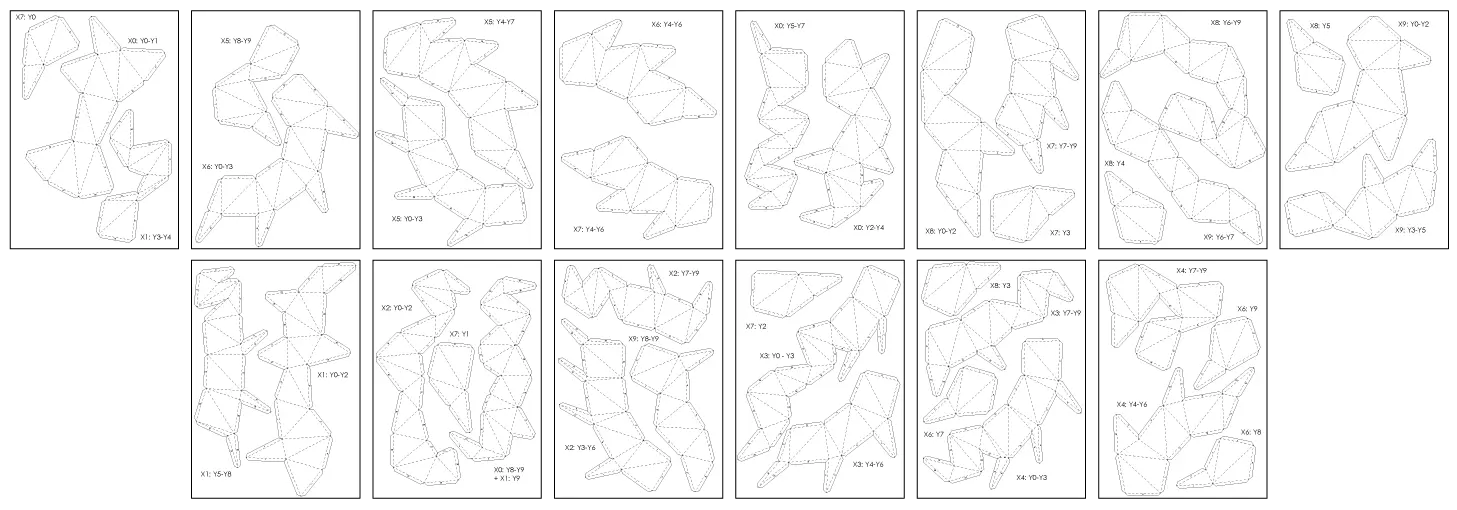
The final iterations are the result of several trials of the grid, panel and hybrid studies. For the grid study I was trying to create high and low points as well as a flow in the right direction that correlated with the sample drapery. The panel study explored how panels flowed from one geometry to another and if their geometries could accentuate the darker regions. This study was essentially a breakdown of the three regions: the drapery, the receded material and the skin. The final hybrid study refined a combination of the most effective grid and panel studies and utilised the best curve attractors to fabricate the contrasting regions. Lastly the artefact involved manipulating the hybrid into a reinterpreted shape for the painting sample to conform to. The artefact was changed significantly from the hybrid with dramatic directional shifts and changes to panel depth and rotation.

The fabrication process was interesting to see how the panels deconstructed to a flat planar surface and if they were developable. During the unrolling of the hybrid, it was important to use the least amount of sheets possible. This is a good practice to have and is beneficial, especially in building design, where cost and material are important aspects to consider.
The painting drapery was expanded upon in the composite by utilising the artefact to extend the outer edges of the regions where the drapery was cropped. The painting was modified to conform to these interpreted extents. The composite appears to accentuate the foreground elements that approach the viewer. The composite is unique in the sense that it re-imagines the painting by developing new sections. The combination of the painting with the artefact, emphasises an orderly movement and explicitly outlines the contrasts between regions. These qualities are hard to identify when presented with the pattern and artefact individually.
More Projects

Bartr App
Rishab Kiran, Stephanie Cheng, Miranda Prestage, Freya Rush, Xinyu Choot, Ed Gu

Buxton Contemporary
Rishab Kiran, Ronald Liao, Xinyu Choot
The Mandala Journal
Rishab Kiran

Black Orpheus
Rishab Kiran

Transurban T5
Rishab Kiran
Eye of the Lacquer
Rishab Kiran
Very Short Introductions
Rishab Kiran
Mario World
Rishab Kiran
Raphael 2.0
Rishab Kiran
City of Isidora
Rishab Kiran

Sydney Samurais
Rishab Kiran

Esports & Social Media
Rishab Kiran