HEY THERE!
I'm Rish.
A UI/UX & Graphic Designer driven by the pursuit of creating impactful experiences through diverse mediums.
Beyond design, you'll find me on the tennis court, drumming to unwind, and recently venturing into 3D printing.
I graduated from the The University of Melbourne, with a degree in User Experience and Graphic Design.
I'm always keen for exciting projects. Feel free to connect with me on any of my socials below.

Bartr is a novel application designed to foster behavior change through a unique bartering process. Serving as a platform for swapping goods, Bartr redefines the traditional exchange model by emphasizing reuse and the value of second-hand items. By encouraging users to engage in this innovative swapping system, the app aims to shift perceptions towards sustainability and promote the concept of reusing goods, thereby bringing new value to items that may have otherwise been discarded.
This project was approached collaboratively from research and ideations till the final prototype. In addition to collaborating on various aspects of the project, my primary focus was on creating the prototype as well as the video production, which aimed to effectively promote the concept and mission of the app.
The complete project reports can be accessed here: Report
The prototype can be experienced here: Prototype
Adobe Illustrator
Adobe Photoshop
Adobe After Effects
Adobe XD
Figma
When approaching the problem space of item lifecycles, stakeholders were identified through a comprehensive rich picture diagram. These stakeholders were classified into three primary groups: producers, consumers, and post-use destinations. Throughout this process, three significant paradoxes surfaced. Firstly, second-hand stores were often perceived as waste removal services, neglecting their potential for reuse due to donations of unsuitable items. Secondly, the dilemma between repair costs and purchasing new items highlighted the financial barrier to sustainability. Lastly, consumers faced the paradox of seeking sustainability amidst higher upfront costs, often opting for convenience over eco-friendly options.
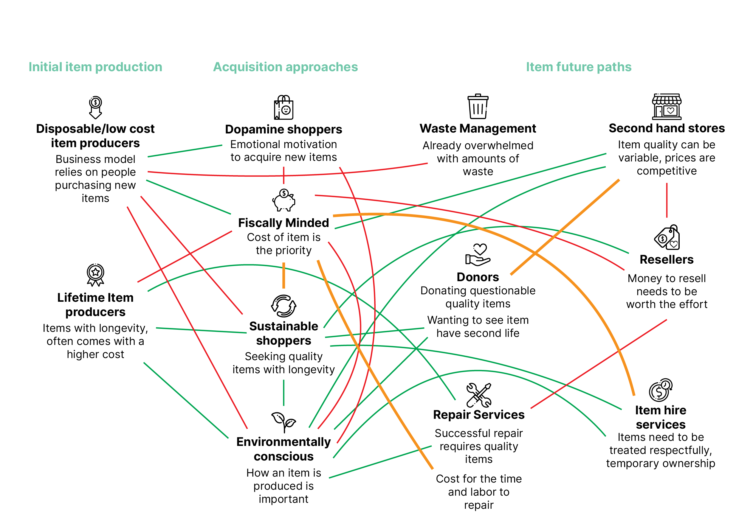
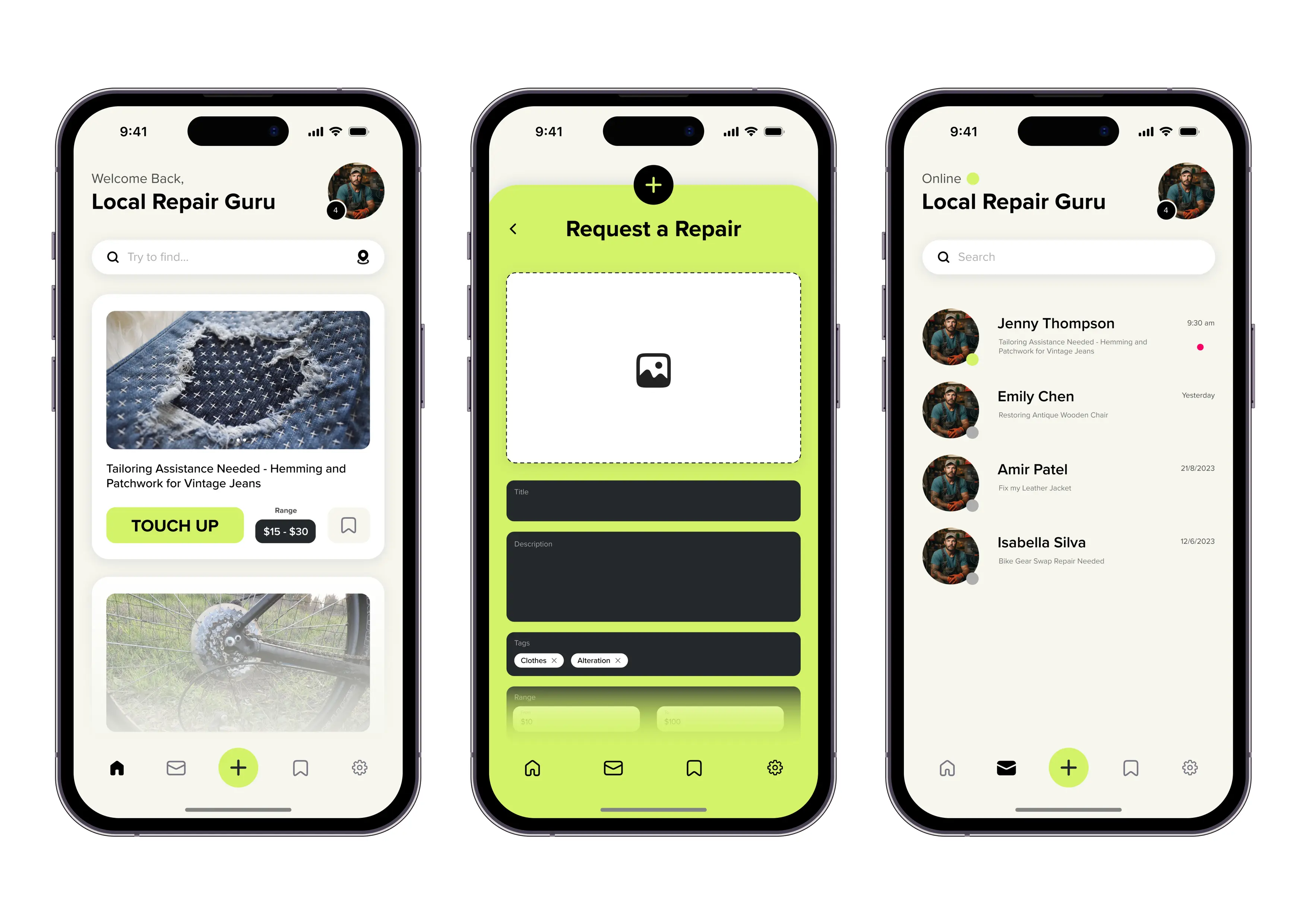
The exploration of the rich picture diagram led to the conceptualization of various design ideas tailored to address specific stakeholder needs. Each team member contributed by proposing a solution targeted towards a particular niche within the stakeholder groups. My focus centered on addressing the space with an innovative item repair service. This app would allows users to to conveniently request repairs for their items, promoting reuse by extending their lifespan. Following the proposal stage, each team member proceeded to develop a prototype of their respective ideas. Each prototype was self-critiqued before collectively deciding on the best way forward.
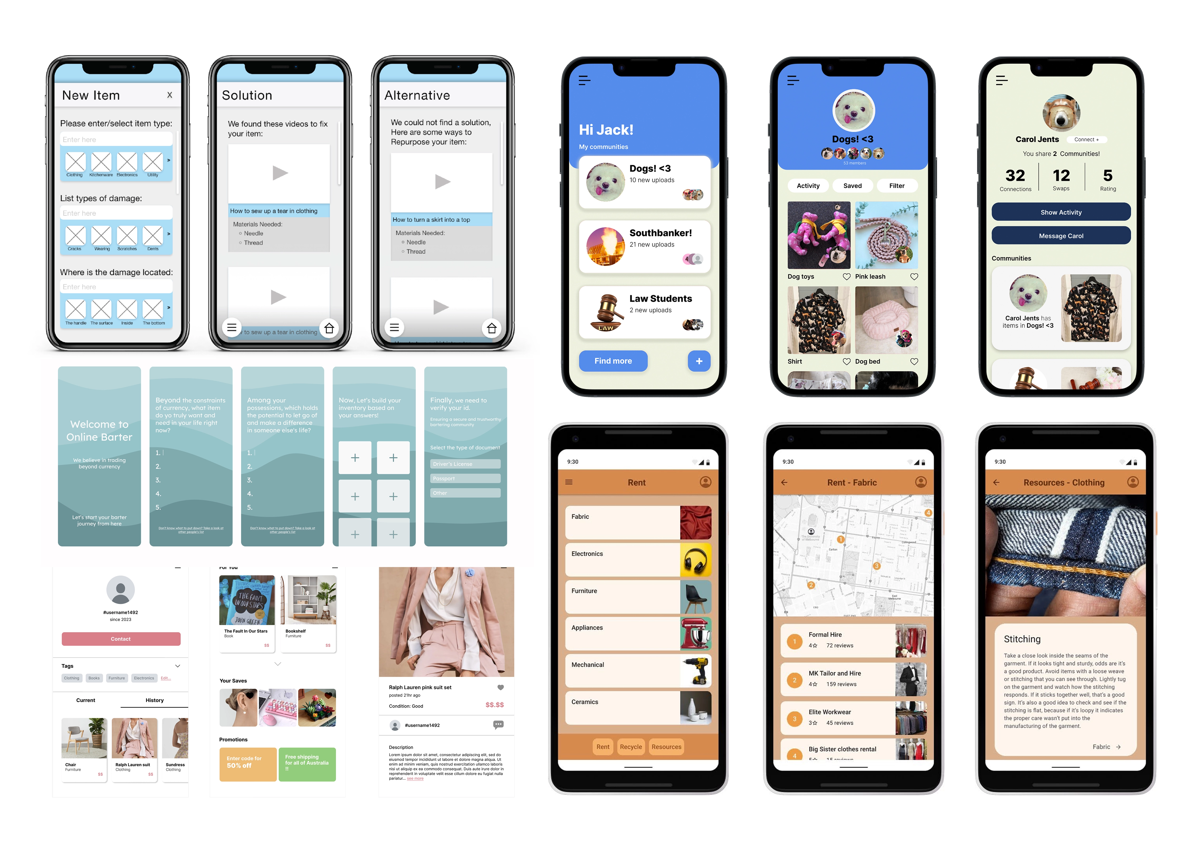
Relevant technologies were investigated to see if the concept could be improved. Several were looked into such as community bins and collective and collectible exchange. However, we opted to integrate a subset of collective exchange known as “Math Trades,” popular within the board game community. This system employs an algorithm to facilitate trades, ensuring participants receive a preferred item or retain their own if no suitable trade is found. Recognising the potential value of this approach, we decided to implement it within Bartr as a recurring feature called Market Day. This fortnightly mass swap event provides users with an opportunity to engage in collective exchange, thereby fostering a culture of reusing goods and driving behavior change. Developing this relatively novel feature presented a considerable challenge so wireframes were created to guide the development process.

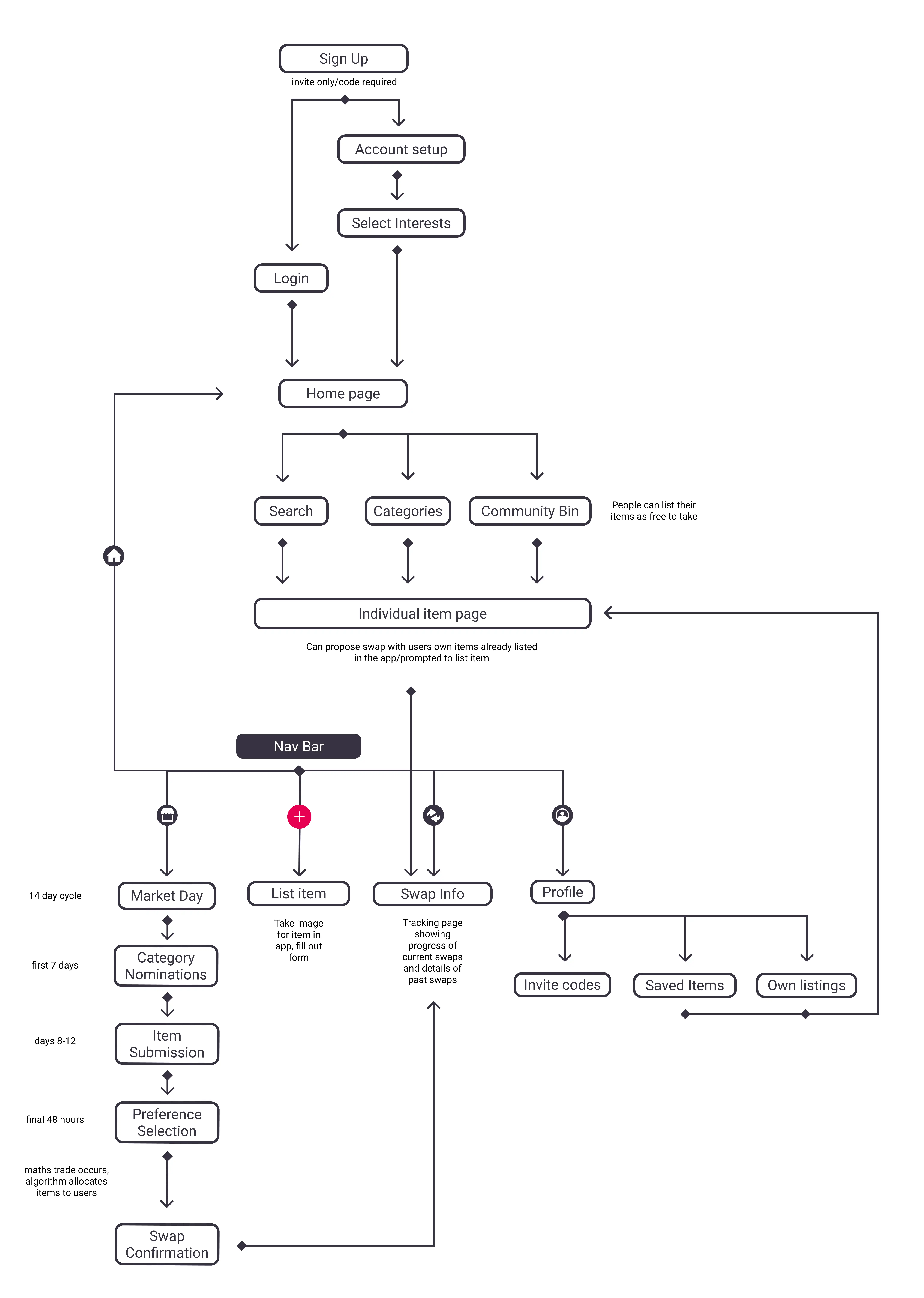
As relevant technologies were researched the site map underwent several revisions and updates. It served as the foundational blueprint for a marketplace application. Drawing inspiration from conventional listing platforms that operate on a monetary basis, the concept was adapted to prioritise item swapping. This approach aims to make the transition more seamless for users accustomed to existing marketplaces, encouraging behaviour change while retaining a familiar framework, as opposed to introducing a completely different process for item swapping and value perception.
The high-fidelity prototype screens were crafted from the ground up using Figma. Early familiarity with the software emerged as an important part of the development process, a proactive approach that favoured learning its intricacies beforehand rather than while in the midst of production. Custom components like navigation bars, search bars, and buttons were designed to maintain consistency and flexibility across the project. This approach extended to the cohesive color palette and typographic choices, creating a harmonious visual experience. This element-by-element approach emerged as the linchpin to maintaining a high level of consistency throughout the app, while also facilitating easy global changes applicable to all screens. Hence the final product was a high-fidelity prototype went beyond the infancy of the low-fidelity wireframes and delved into experimental layout designs, with a keen focus on achieving a user-centric and engaging interface.
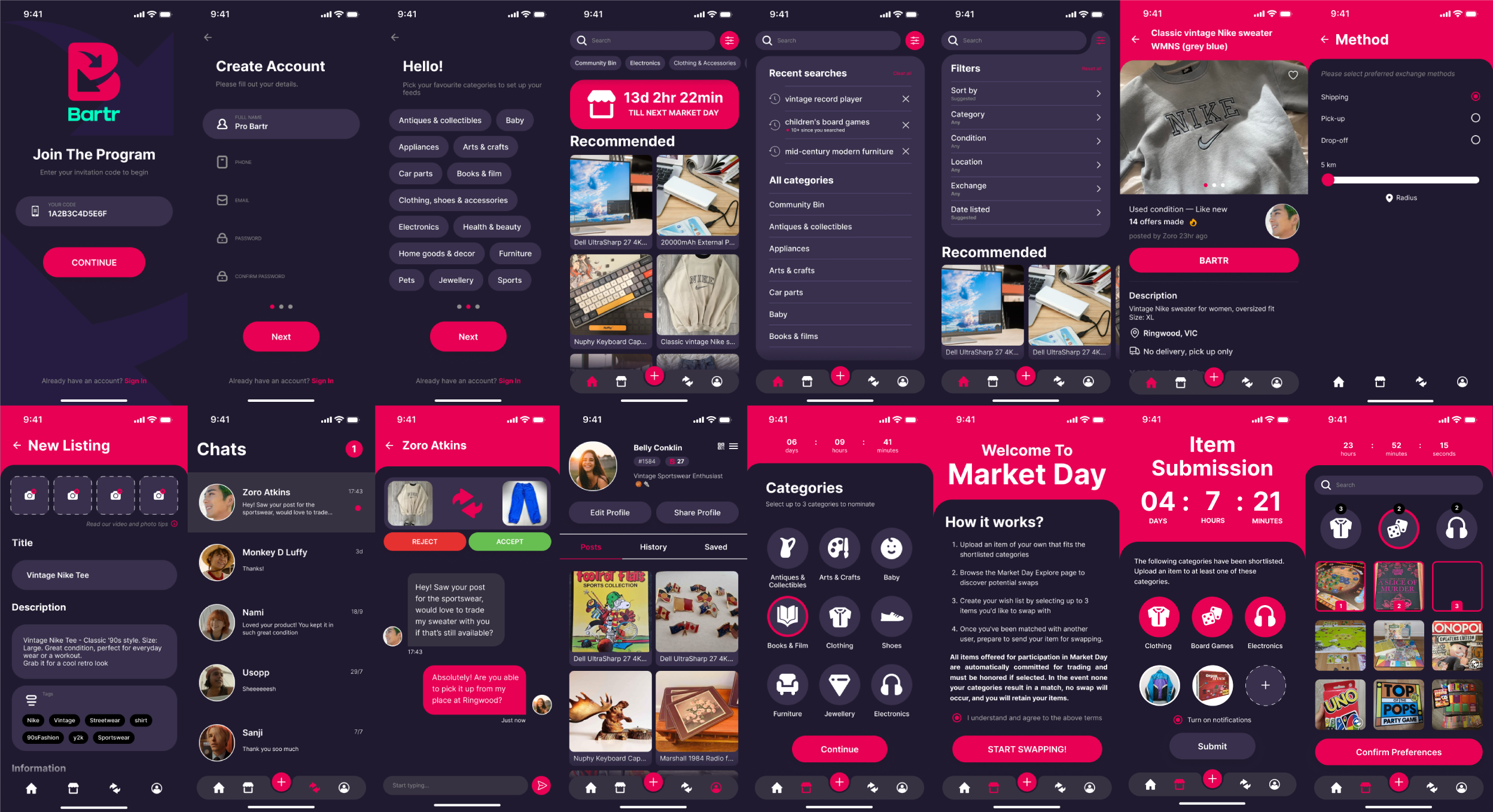
Through user-based testing, the prototype performed well in the sense of task completion. The core layout was fairly intuitive and recognisable as “something like facebook marketplace”. This feedback appeared to validate the design approach, utilising existing mental models to create a marketplace experience that felt familiar. However, there was a consistent challenge in assessing how well participants comprehended the Market Day concept. Overall the testing aimed to communicate a new concept to users with mixed success but feedback suggested several paths forward to improve the concept.
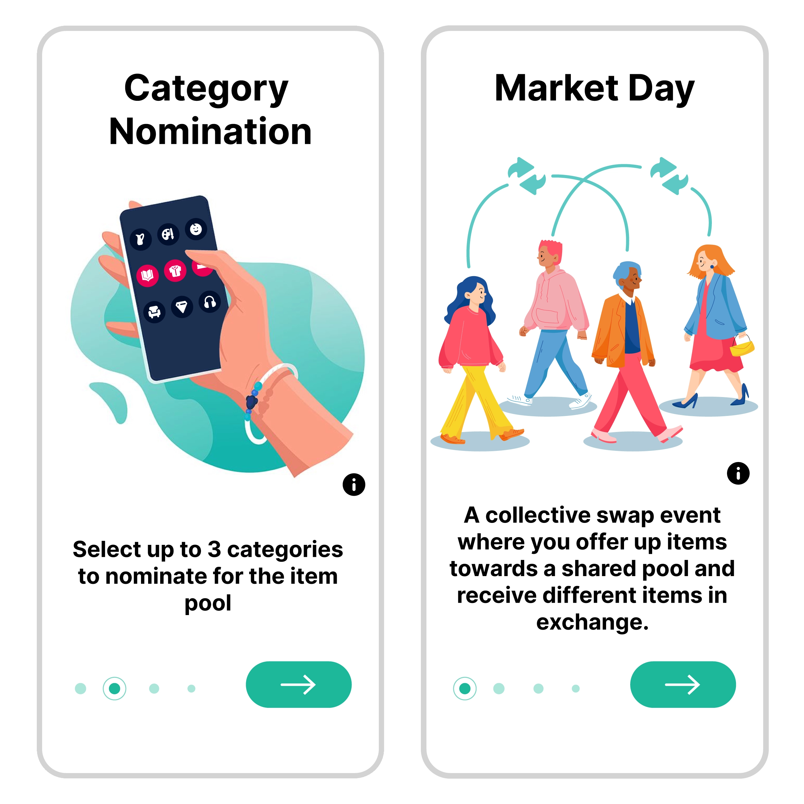
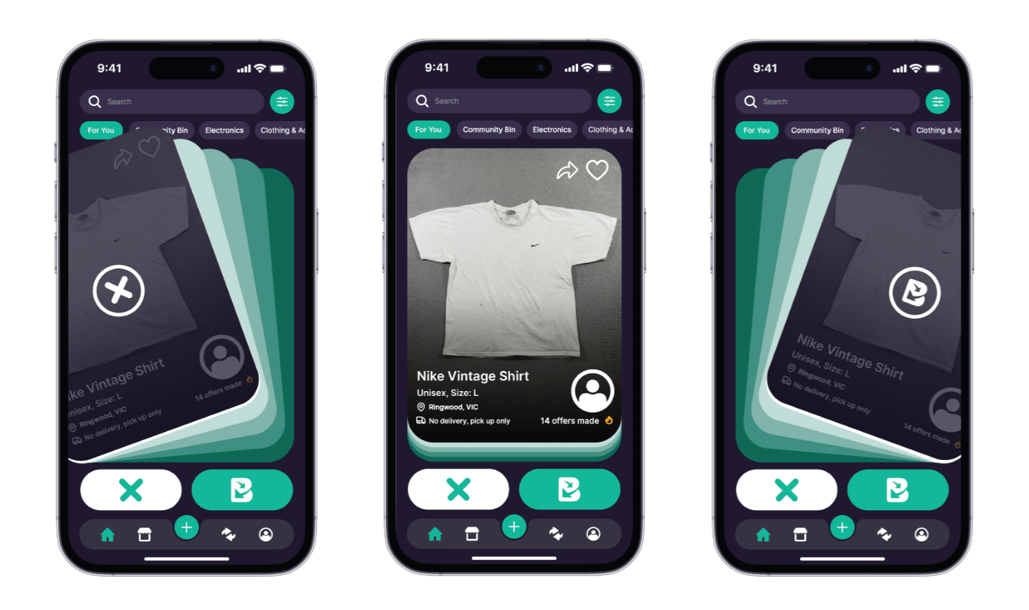
In the upcoming design cycle, the focus will be on enhancing the clarity and usability of the Market Day feature within the app. The emphasis will shift towards guiding users through actions rather than relying on recall, with a priority on ensuring documentation is easily retrievable when needed. One potential approach involves incorporating step-by-step instructions on the introductory screen, presented in a visual format such as a grid or swipeable screens. However, a challenge lies in finding the right balance between visual presentation and memory retention. Additionally, the social aspect of the app will be further capitalised upon, drawing inspiration from popular social media platforms like Instagram and TikTok. Additionally a 'Tinderising' approach may be explored, allowing users to engage with items through features like liking, sharing, and swipe mechanics. Implementing competitive elements such as point systems and leaderboards could increase user engagement and a potentially higher volume of successful trades. Overall this approach has the potential to personalise user experiences and increase overall trading activity within the community-driven platform.
More Projects

Bartr App
Rishab Kiran, Stephanie Cheng, Miranda Prestage, Freya Rush, Xinyu Choot, Ed Gu

Buxton Contemporary
Rishab Kiran, Ronald Liao, Xinyu Choot

The Mandala Journal
Rishab Kiran
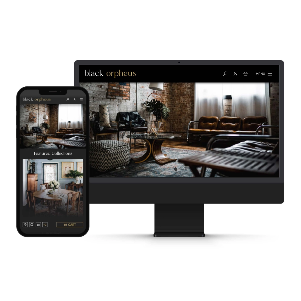
Black Orpheus
Rishab Kiran

Transurban T5
Rishab Kiran

Eye of the Lacquer
Rishab Kiran
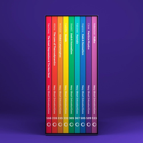
Very Short Introductions
Rishab Kiran

Mario World
Rishab Kiran

Raphael 2.0
Rishab Kiran

City of Isidora
Rishab Kiran

Sydney Samurais
Rishab Kiran

Esports & Social Media
Rishab Kiran
